Part 1
Intro
I started using Lifesum recently to track my food and workout sessions to achieve my fitness goals. I was using MyFitnessPal since November, there everything was about food tracking and data, with a very outdated design hence the reason to try the new app. I’m just using the free version but it still gives me some tips on how to improve my habits and it’s available for Apple Watch and iPad.
More app screens: https://mobbin.design/apps/lifesum


Why do I think the UX is successful?
Even though Lifesum is a massive app, it is super easy to use with clear user-friendly flows. We start the onboarding with a brief questionnaire about ourselves, such as age, weight, height, and also asks us to enter our weight goal, depending on if we want to lose, gain, or maintain. Once everything is filled the app presents us with the main screen (Diary) where we can find the recommendations for our daily intake. With sections for breakfast, lunch, dinner, snacks, water and exercise, there is no way to miss the free calories counter.
Adding a meal is as simple as clicking a plus button, searching in the database or scanning a barcode, choosing the amount and adding the food. The app automatically recalculates the calories and gives us hints if we are on track, over or below for each meal. The meal plans and recipes are extras that can be found in the navigation, for that we need to pay for the premium subscription but we still have a preview of those features.
The app fetches data from the fitness apps we use and counts them as exercise, these apps are not 100% accurate but it’s nice to have an overview of our daily exercise alongside our remaining calorie intake allowance. Overall it is a pleasant user experience with some nice to have features, my only dislike is the fact that they push too much for the premium features.
Why do you think the visual execution is successful?
The design of the interface makes it lovely to view and interact with a consistent palette of colour, layout, and font. The hierarchy of information is clear, designed in a way that allows the user to quickly find what they are looking for.
The friendly illustrations reflect a bit of the personality of the brand giving the impression of a fun yet insightful app plus the animations indicating successful operations make it a more intuitive and playful experience.
The only drawback is that since they want to push the premium features so badly we are visually bombarded with hints to get premium and that can become annoying with extended usage. I would like to choose if I want the premium features without the visuals being so invasive.
Part 2
How you would improve or further develop this product?
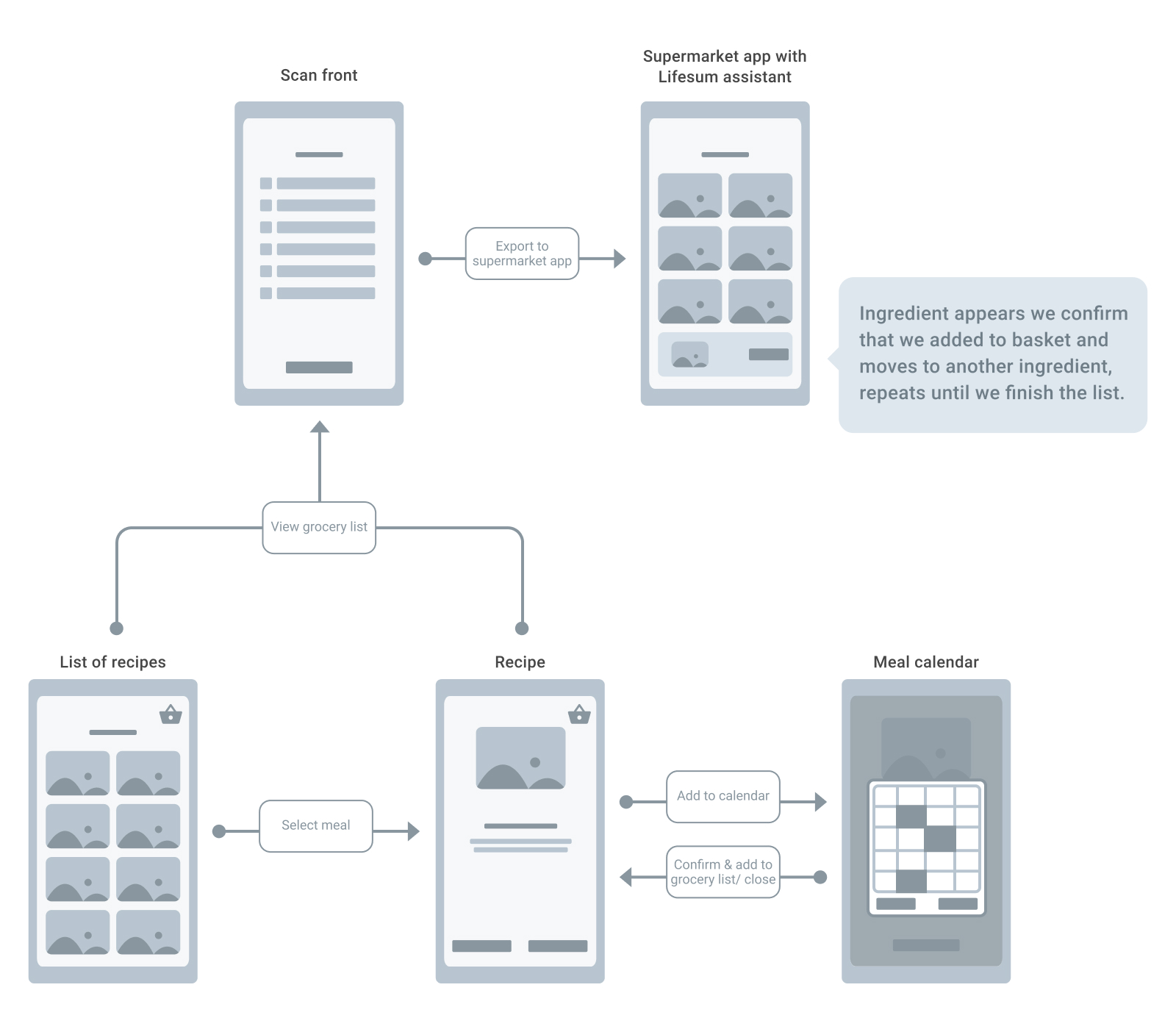
The only piece I wish they would add is the ability to plan meals and compile a grocery list that could be connected to our favourite supermarket app. If they implemented that I would consider the premium subscription.